Every medical website is unique, and who better than us to understand the unique needs of your practice and render it in a professionally designed medical website that speaks about the values of your practice.
With 70,000 healthcare searches performed every minute and 83% of patients booking doctor’s visits through hospital websites, a highly engaging medical website with an intuitive design becomes necessary.
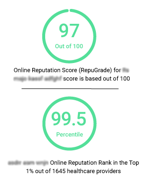
At GMR Web Team, we create medical websites with a magnetic personality, attracting patients to your practice. We augment your website with our proprietary reputation management software that sifts positive reviews to help your practice stand apart from the competition, getting you more patients.

A modern website design customized to reflect the needs of your practice.

A website designed to adapt & adjust to different screen sizes, browsers and devices.
Manage website updates as per your own convenience and schedule.
Powerful and dependable web hosting structure for high performance.
Conformity with HIPAA guidelines to ensure patient data security.
An inclusive website that’s easily accessible by individuals with disabilities, encouraging equal online access.
Secure and encrypted connection to keep all your patient data safe.
Organize, control and modify website content to keep it updated and present.

Ensure your patients find you easily with a website that outperforms in search engine rankings.

HTML and PDF-based intake forms to reduce the waiting room time of your patients.

Integrated reputation management system to churn out positive reviews and turn prospects into patients.

Embed positive reviews and patient feedback on your website, and upkeep your practice’s reputation. Example

Educate your audience with healthcare insights and tips.

Add authentic visual appeal to your website and make your website more engaging.
Our design portfolio reflects our team's expertise in transforming healthcare brands into a visually compelling online presence. Our mission is to go beyond aesthetics and create an immersive online experience that aligns with your brand's unique personality and engages your target audience effectively.
Take a look at what we accomplished for some of our valued clients:
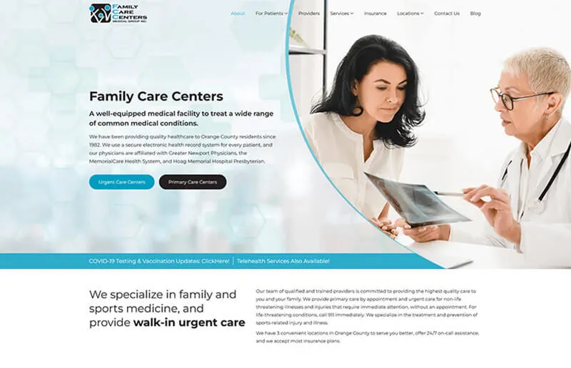
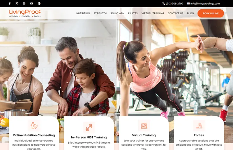
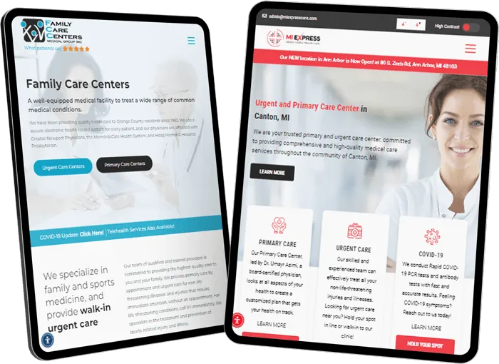
Family Care Center Medical Group
For Family Care Center Medical Group, our goal was to market three urgent care and three primary locations with 25+ providers. Our design strategy was to showcase the diverse services across different locations. By carefully mapping services to locations, we ensured that the audience could easily navigate through offerings provided by Family Care Medical Group.
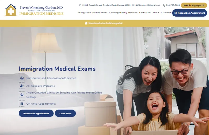
Immigration Medical Exam by Steven Wittenberg Gordon, MD
Highlighting the provider's expertise was critical in the case of the Immigration Medical Exam website. Through our design, we showcased the provider prominently and embedded positive reviews to establish trust. This approach highlighted the provider's proficiency in delivering Immigration Medical Exam services.
Medical Hair Transplant & Aesthetics
For Medical Hair Transplant & Aesthetics, our design strategy was centered on showcasing the transformative effects of their services. By placing before-and-after visuals at the forefront of user interaction, we created a compelling narrative that immediately engages visitors and underscores the efficacy of the services.
One Medical Center
Launching this brand-new practice required a multifaceted approach. Our goal was to design a website that highlights their services and unique value propositions (UVPs) at the first point of interaction, establishing brand authority and encouraging user engagement.
Metro Urgent Care
With a primary audience spanning two languages, English and Spanish, our design for Metro Urgent Care was carefully crafted to resonate with both language-speaking audiences. The color scheme, theme, and overall aesthetics were meticulously chosen to cater to the diverse linguistic preferences of the target audience.
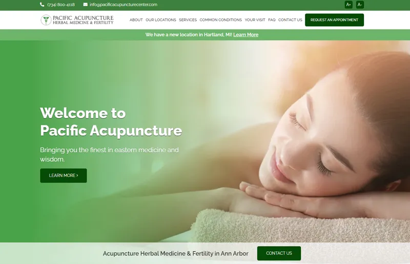
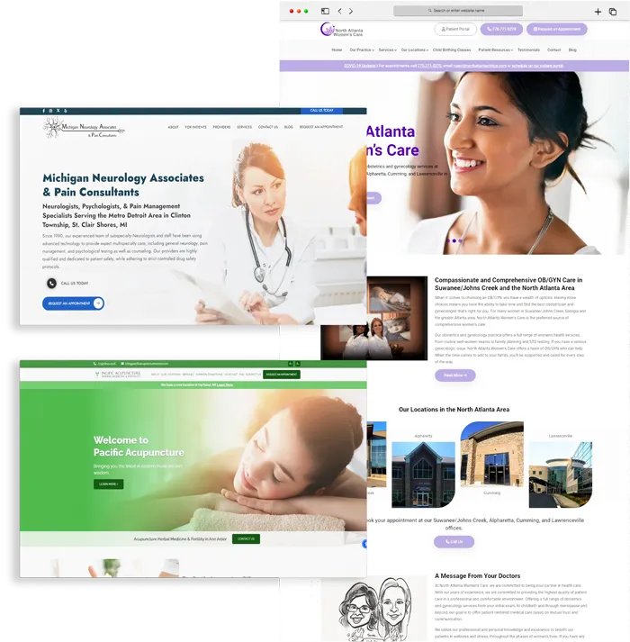
Pacific Acupuncture
For Pacific Acupuncture's website, we incorporated color psychology to create a visually appealing and user-friendly experience. The website design was created to align with the nature of the services offered.
Hoffman Audiology
The Hoffman Audiology website was designed to highlight both services and hearing aid products they offer, ensuring that patients and audiences looking for products weren't overlooked. Through thoughtful design, we ensured that visitors could easily find information related to services and hearing aid products.
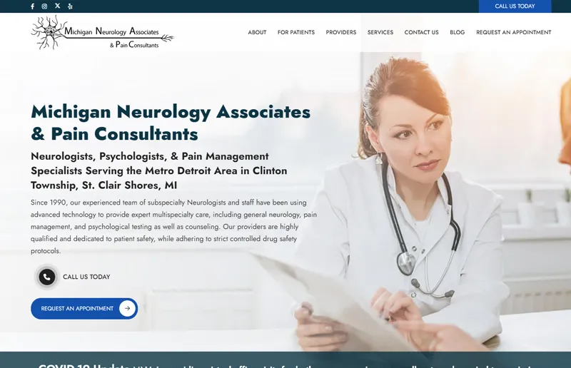
Michigan Neurology Associates
Understanding the unique needs of neurology, the website design for Michigan Neurology Associates incorporated custom illustrations of brain structures and neural pathways. A subdued and calming aesthetic was adopted to prioritize patient education, explaining complex concepts in an accessible manner.
North Atlanta Women's Care
The North Atlanta Women's Care website showcased a color palette and design elements that reflect a feminine feel and appeal to women's psychology. Soft imagery featuring diverse women created an inclusive and welcoming atmosphere, complemented by clear calls to action and appointment forms.
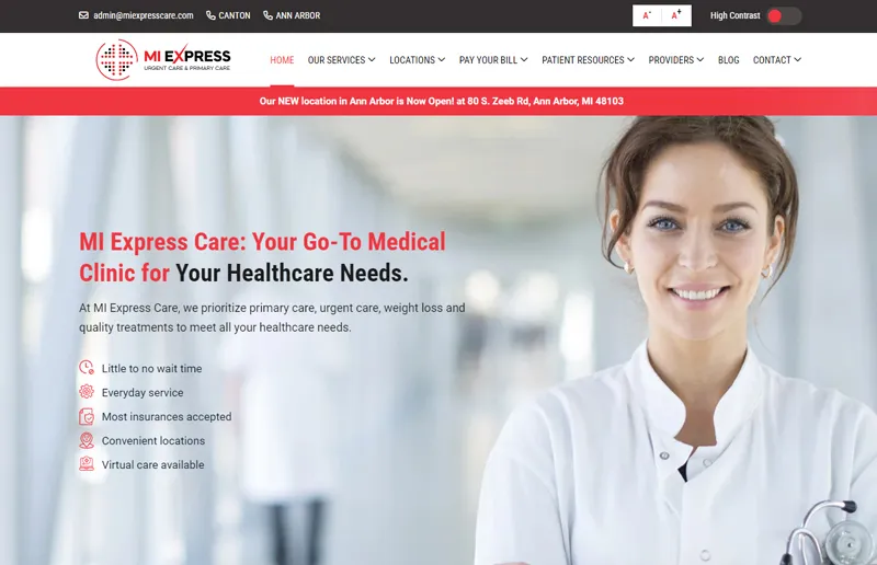
MI Express Care
Embracing a minimalistic approach for MI Express Care was crucial due to the diverse range of services offered. We minimized unnecessary elements, focused on specific content, and streamlined appointment forms for different services, ensuring a seamless experience for patients seeking urgent care to IV Hydration Therapy.

Our Medical Website Service Plan starts at $149/Month. We also offer add-on services starting at as low as $149/Month, giving you the freedom to customize your plan to suit your needs.
Worried you will be tied down to your web developer through a templated website? At GMR Web Team, your website will be owned by you! If you choose to end your partnership with us, you can take your website with you for a nominal fee.


Increase in website traffic in just 11 month.
Urgent Care and in Primary Care in Canton, MI

Our website design and development package starts at $149 per month and includes features such as CMS access, hosting services, appointment request forms, patient acquisition optimization, reputation management, and more. The cost also depends on the additional services you request, like branding, content development, and more. Contact us for a custom quote.
It can take 4-6 weeks or more, depending on the features (number of services pages, contact forms, etc.) and approvals from your end.
No! Our design and development experts will discuss your requirements to create the appropriate number of pages.
You can update the changes through your website CMS or request the changes through our help desk portal.
Yes, you can link your website to your patient portal.
We do! We provide reliable and secure hosting services along with website design and development.